Custom Editor
Welcome to the documentation for the latest feature in the grid chart software, version 5.2. This exciting update empowers users with enhanced chart personalization capabilities, allowing them to tailor their charts to their specific preferences. This guide will walk you through the various steps and options available in this new feature. Enabling Customization To get started with the customization function, follow these steps:
1. Keyboard Shortcut:
Hold down the “Ctrl” key on your keyboard and left-click on any metric or attribute header to activate the customization feature.
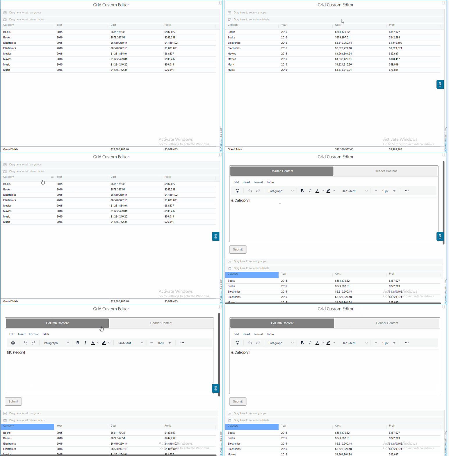
2. Using the Hamburger Menu:
Alternatively, access the hamburger menu and choose the “Format” button. This will also open the custom editor.

Custom Editor Overview
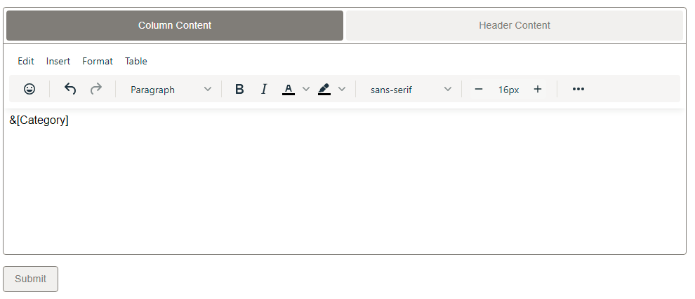
Once the custom editor is enabled, the custom editor will be your tool for making changes.Below is an illustration of how the custom editor looks when launched.
Tabs for Formatting:
Column Content Tab:
Apply formatting to the content area of a selected element’s corresponding column (attribute or metric). Changes are displayed within the column’s content.

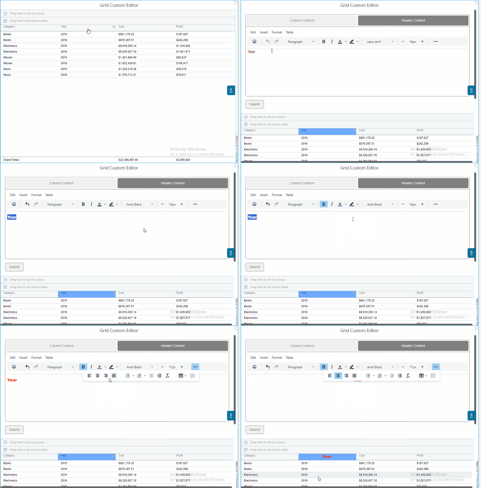
Header Content Tab:
Apply formatting to the header of a selected element’s corresponding column. Changes are reflected in the column header.
Custom Editor Menu:
Below the tabs, you’ll find the “Custom Editor Menu.” This menu offers a range of customization options:
Images:
To add photos to the chart, use the “Insert” property tab. This brings up a new pop-up menu where we can add the picture and URL to the Source field box and adjust the width and height to make it visible within the grid.
Links:
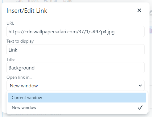
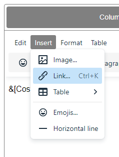
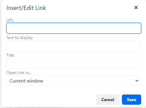
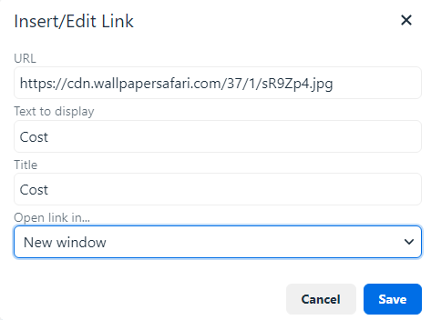
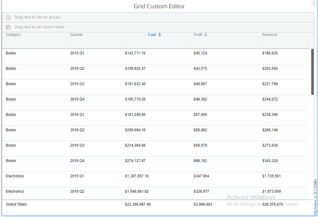
To add URL links to an attribute or metric, select the “Insert” property tab. This brings up a new pop-up menu where we can choose the link we want to add, give it a name using the title property, and choose whether to open the link in a new tab or the same window as it is currently open.
To unlink the set link right click on the added link and click the remove link option.
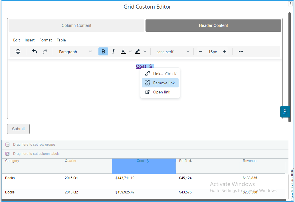
Table Menu:
Imagine that we are designing a sales analytics dashboard with a customized editor’s table displaying data on product sales. The typical data columns (Product Name, Units Sold, Revenue, etc.) should still be included, but you also want to include more in-depth breakdowns using tabular data in specific cells.
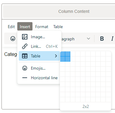
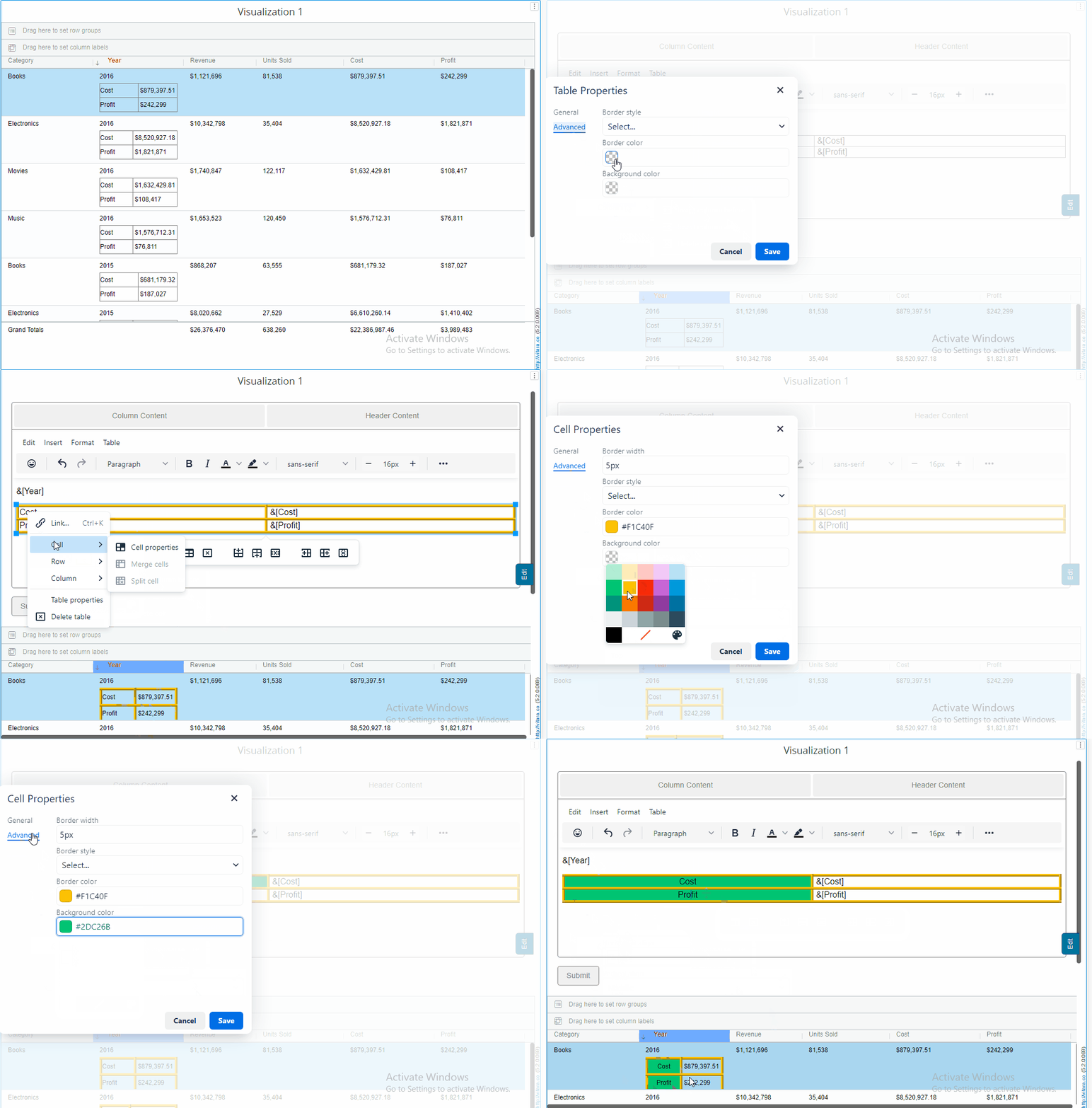
To add tables to the chart, go to the “Insert” tab and arrange the rows and columns to build a table. Then, in each cell, we can fill it with macros of our choosing to be displayed on the grid.
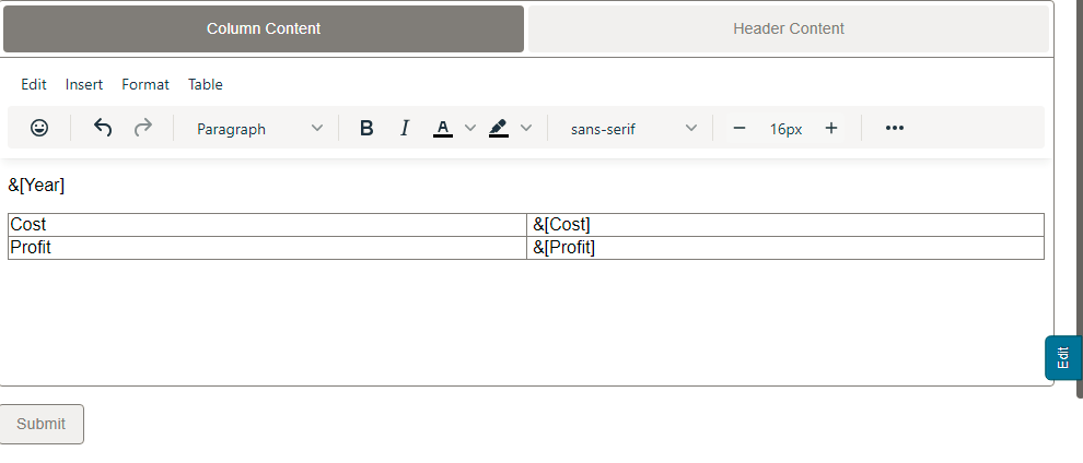
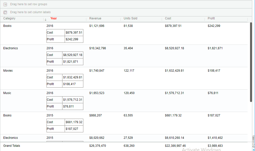
Furthermore, we can individually customize each cell individually by going to that specific cell and then right clicking to open a menu where we can further customize the cell properties and set border color, style, width, and similar for the table properties.
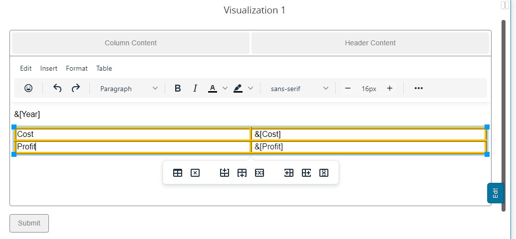
We can also add, merge and delete row/columns from table itself with the below table property
Format Menu:
Assume you’re creating a financial performance dashboard to display quarterly sales statistics. Instead of presenting plain numbers, you decide to use Grid’s versatility and the formatting features of the custom editor to improve data clarity and presentation.
The format box provides an abundance of options, including bold, italics, underlining, strikethrough, superscript, subscript, and various formatting options. alignments, font sizes, line height, background color, and many others.
To apply the formatting head to the metric/attribute where we want to make formatting and select the formatting and hit submit button to apply changes.

Toolbox Panel:
The toolbox panel is situated below the custom editor menu. It provides convenient buttons for quick text adjustments, eliminating the need to navigate menus.

Inserting Elements:
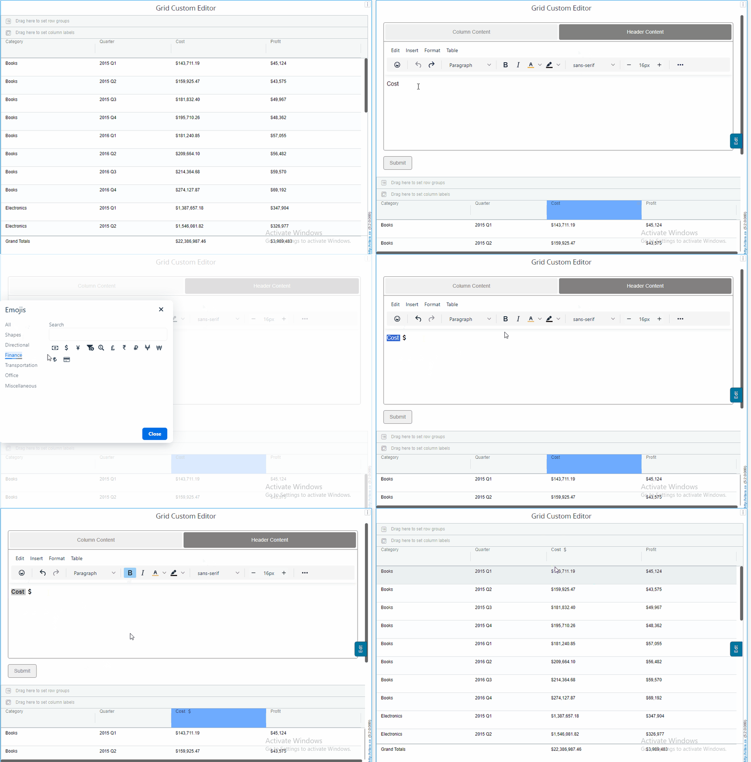
The custom editor empowers you to insert various elements into your chart: Emojis: Add a touch of emotion to your chart.
Undo & Redo: To restore or revert the performed actions.
Formatting: Applying formatting like Bold, Italic and text color, Background, Size and font.
Tables: Organize data effectively.
Applying and Exiting
After making the desired formatting and modifications, simply hit the “Submit” button to see the changes take effect.
To exit the custom editor, click anywhere on the grid chart. This will return you to the default view.
Creating Metric/Attribute Groups
To group metrics or attributes, follow these steps:
1. Selection:
Hold down the “Ctrl” key on your keyboard.
2. Grouping:
Left-click on the metric or attribute headers you want to group.
3. Column Grouping Button:
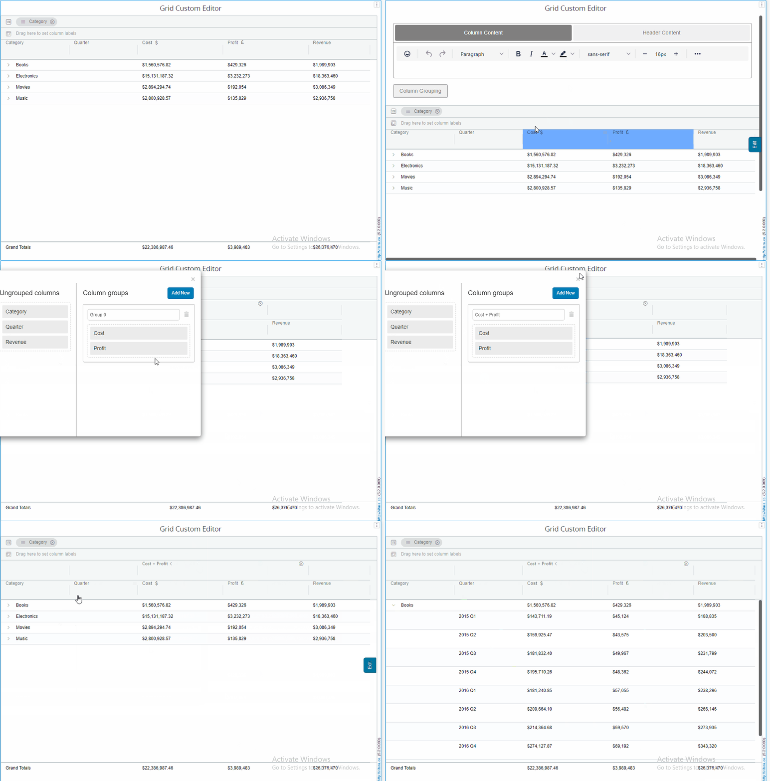
In the custom editor, you’ll find the “Column Grouping” button. Clicking it will create the group for you.
With these instructions, you’re ready to dive into the exciting new world of version 5.2’s grid chart customization. Enjoy tailoring your charts to perfection!