Horizontal Bars/Pin
The display style property, which can be accessed from the hamburger menu, allows the user to display any given individual metric as a horizontal bar or horizontal pin’s.
It can display the scaling as bars and pins.Hover onto a metric for which the trendlines need to be applied so that the hamburger button will be displayed. Click on the hamburger button, then a menu will be opened. Hover the mouse onto ‘Display Style’, then a submenu will be opened which has the trendline charts. Please refer the below screenshot:
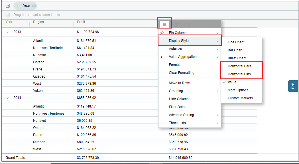
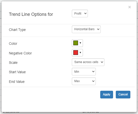
First, for a metric, apply the ‘Horizontal Bars/Pins’ trendline, and then format the bar/pin color and negative color. open the format window, then set the color (e.g Green). Click the ‘Apply’ button
In our case, we’re displaying sales and profits by region and year, with horizontal bars for metric “profit” and horizontal pins for metric “sales”.
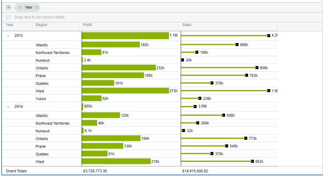
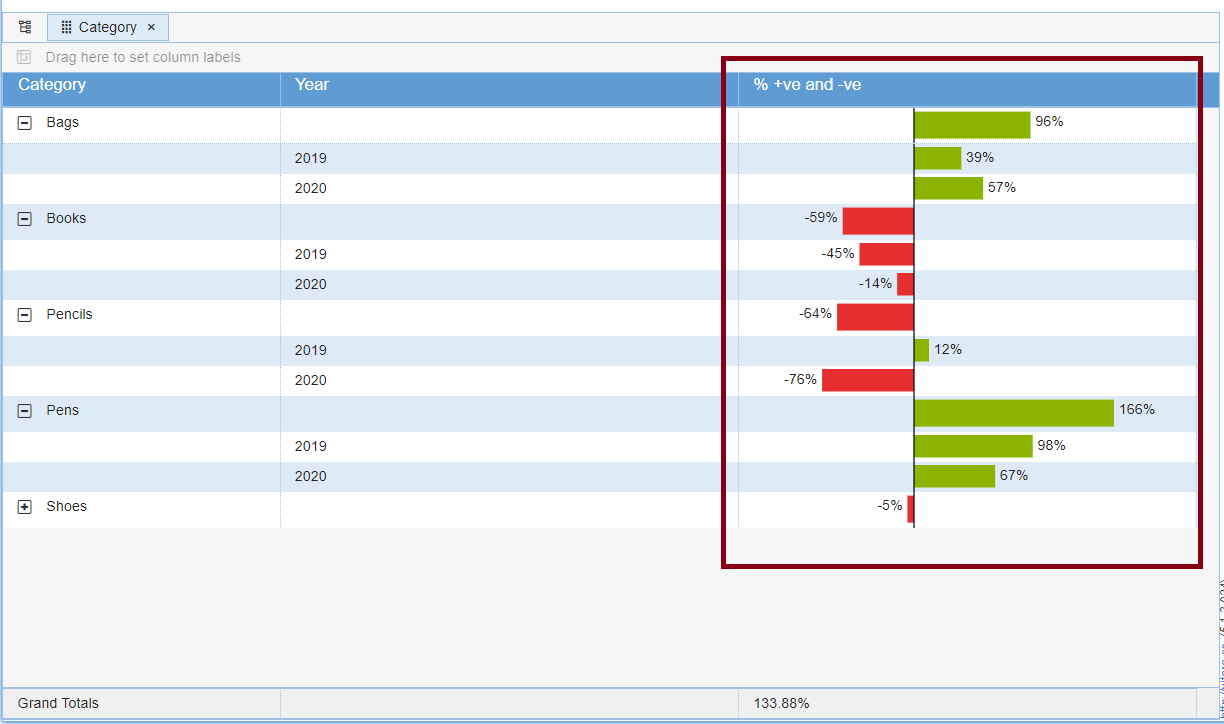
Scaling across cells for Horizontal Bars and Pins
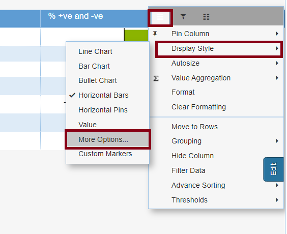
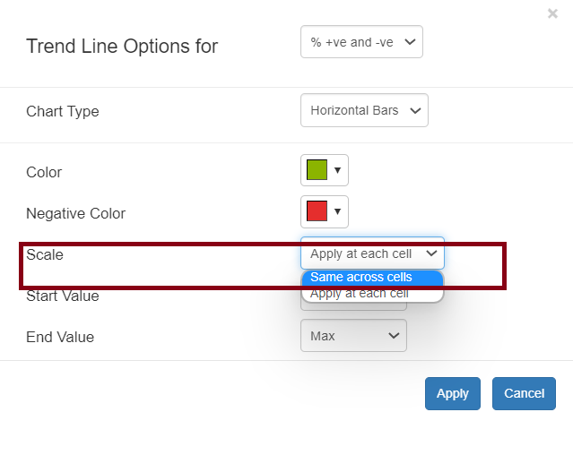
From Version 5.1.2, We have introduced a new Scaling option which can be found from the Hamburger tab in the Display Option under More Options.
The chart scaling is set to ‘Apply at each cell’ by default; to allow scaling, change the Scale option to ‘Same across cells.’
