Properties Menu - Trend Lines
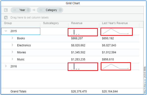
From the 4.1 version of Vitara Charts, trendlines are introduced in Grid Chart. This feature helps in converting the grid chart to micro chart.
Below is the screenshot of trendlines in the grid chart.
Inputs
Attributes: 2 or more
Metrics: 1 or more
In the Grid chart, the trendlines are always applied for the second level grouped attribute in the chart irrespective of the number of attributes. And that attribute is called the ‘trend by’ attribute.
To use trendlines in a grid chart, the grid should be either in grouped mode or pivoted. To know about Grouping and Pivoting in Grid chart, click here
There are three types of trendlines in the Vitara Grid chart. They are
- Line Chart
- Bar Chart
- Bullet Chart
Steps to apply trendlines
Step 1
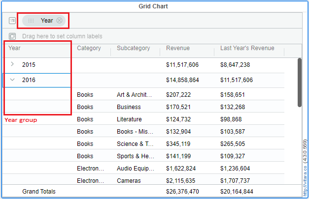
Create a Grid chart with a minimum of 2 attributes and 1 metric. Drag an attribute with which you have to create groups into the Group dropzone.
Below is the screenshot of a grid chart with 3 attributes and 2 metrics and the groups are created using the ‘year’ attribute.
Step 2
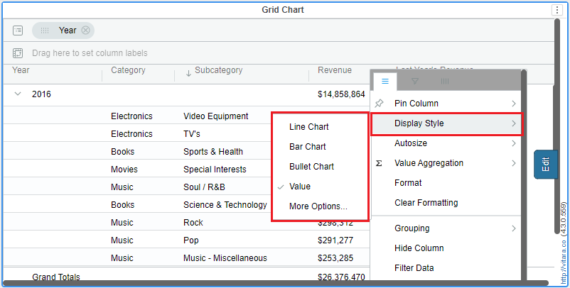
Hover onto a metric [Revenue metric in this case] for which the trendlines need to be applied so that the hamburger button will be displayed. Click on the hamburger button, then a menu will be opened.
Hover the mouse onto ‘Display as’, then a submenu will be opened which has the trendline charts. See the screenshot below:
Step 3
Click on the trendline of your choice on that menu. For example, we will click on the ‘Line chart’ here. Then the trendlines for the ‘Revenue’ metric looks the below way. See the screenshot.
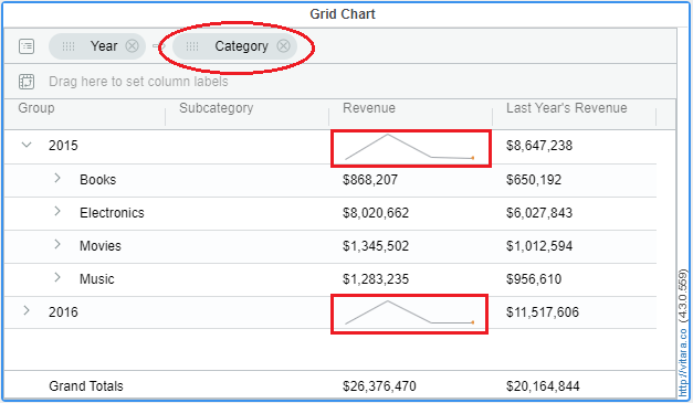
If you have noticed the above screenshot, the ‘Category’ attribute got grouped automatically after applying trendlines for a metric. This is because the trendlines are always applied for the second attribute in the chart.
Unsetting the Trendlines:
After applying trendlines for metrics, we can remove them using the below steps.
- Open the hamburger menu of the metric in which trendlines need to be removed.
- Hover onto ‘Display as’ and wait for the submenu to open.
- Click on the list item ‘value’. See the screenshot below.
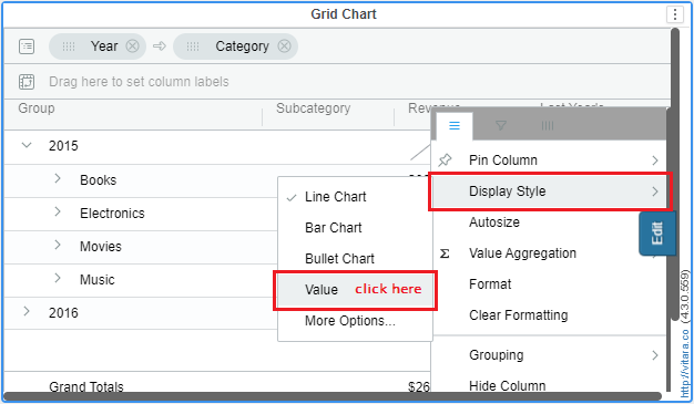
Then the trendlines will be removed for that metric and value will be shown as in the screenshot attached in Step 1.
Formatting the Trendlines:
In Grid chart, we cannot simply apply trendlines but we can also format them. We can format the trendlines according to the type of chart applied.
To go to the trendlines format window, apply trendlines for a metric and open its hamburger menu. Hover on to ‘Display as’ and wait for the submenu to open up. Click on ‘more options’.
See the screenshot.
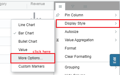
When you click on ‘more options’, the below window will be opened.
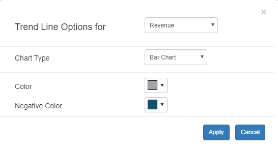
In the above screenshot, Trend Line Options for dropdown allows you to select a metric on which you need to apply trendlines.
And Chart Type dropdown allows you to select a trendline chart for a particular metric selected in the above dropdown.
Let us look into chart-wise formattings
1. Line Chart
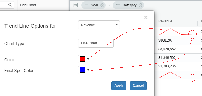
For Line charts, we can format the line color and the final spot color.
To start with, first apply the ‘Line Chart’ trendline for a metric and open the format window.
Then set line color (e.g, red) and also the final spot color (e.g, blue). Click on ‘Apply’.
See the screenshot below with applied formattings.
2. Bar Chart
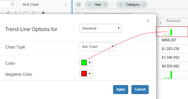
For Bar charts, we can format the bar colors and negative bar colors.
To start with, first apply the ‘Bar Chart’ trendline for a metric and open the format window.
Then set Bar color (e.g, green) and negative color (e.g, red). Click on ‘Apply’.
See the screenshot below with applied formattings.
3. Bullet Chart
For Bar charts, we can format the bar colors and negative bar colors.
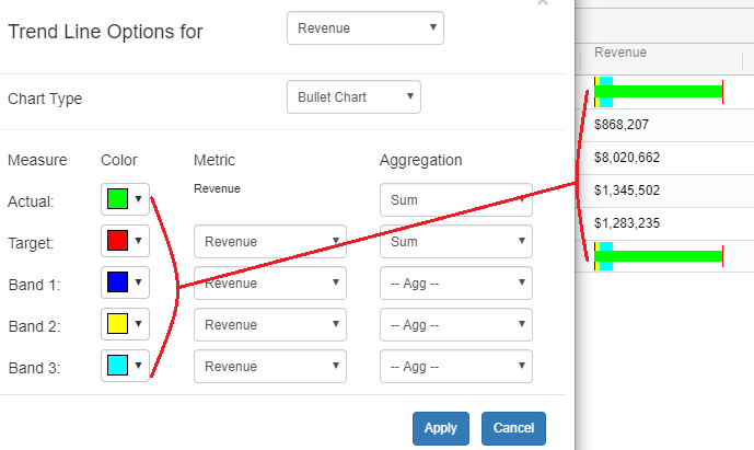
To start with, first apply the ‘Bullet Chart’ trendline for a metric and open the format window.
Then set Actual color (e.g, green), Target color (e.g, red) and 3 band colors (e.g, blue, yellow and aqua). Click on ‘Apply’.
See the screenshot below with applied formattings.
Axis Specificity
From the 4.5.4 release, for the line chart and bar chart as trend lines, user can select the specificity of the axis for the same.
Earlier we default to using the same scale across all the rows for the same metric. Of course with this any large outliers are a problem. In the 4.5.4 release we added an optional setting to not use the same scale and show each row’s trends independently.
Now the customer can choose one of the option from the two,
a) same scale across all the rows for the same metric:
This is the default option and the minimum and maximum of the scale will be based on the minimum and maximum of that metric.
b) Apply at each cell:
Apply at each cell will be based on the trending minimum and maximum under a display group.
In the below example the use these two options is explained in detail.
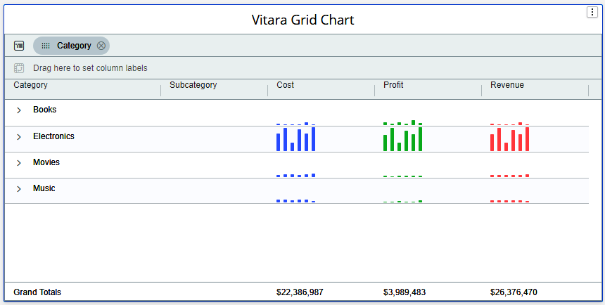
As stated above, by defalut for each metric the bars hieght is set by considering minimum and maximum values from the entire metric. The least hieght of the bar corresponds to the minimum values of the metric and biggest bar corresponds to the maximum values of the metric.
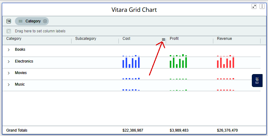
In the below screenshot, the category - Electronics has biggest numbers when compared to the other other categories. Therefore the hieght of the bars for other categories - Books, Movies, and Music are too small and not visible properly.
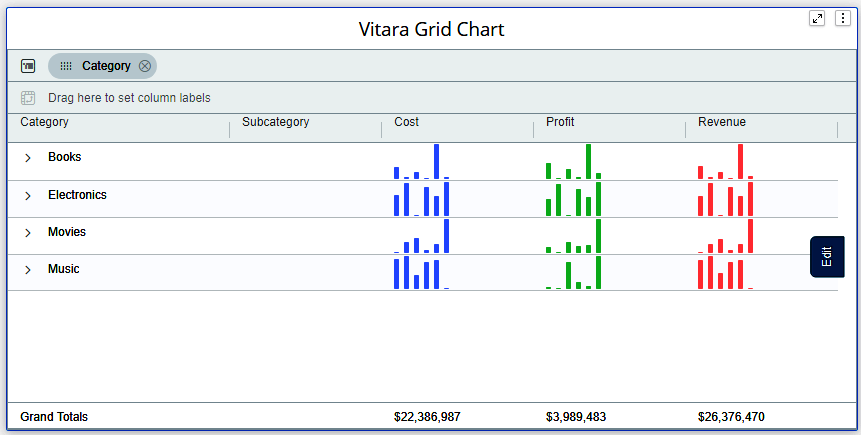
The below screenshot is the vitara grid chart in which bars are set as trendlines.
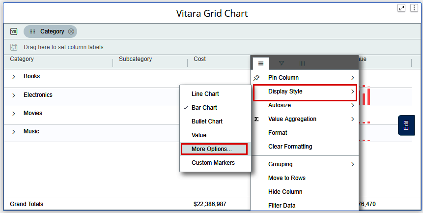
If we want to make hieghts of the bar in each cell (group element) independent with other cell we have to choose the option - Apply at each cell. Click on hamburger button of the metric on which you want to enable this feature.
Expand the “Display Style” menu and select “More Options”.
Expand the Scale dropdown box and select the option - Apply at each cell and click on Apply button.
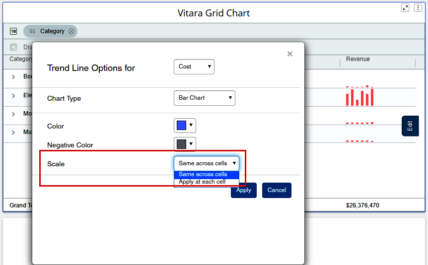
By selecting this option Vitara Grid chart will consider the maximum and minimum values with in the cell (group element) of that particular metric.
For example, if we consider the Cost metric, from all the bars of Books category the least value is given smallest bar hieght and the maximum value is given the biggest bar hieght.
Likewise the minimum and maximum values are calculated for each category of the metric instead of whole metric’s minimum and maximum values.
